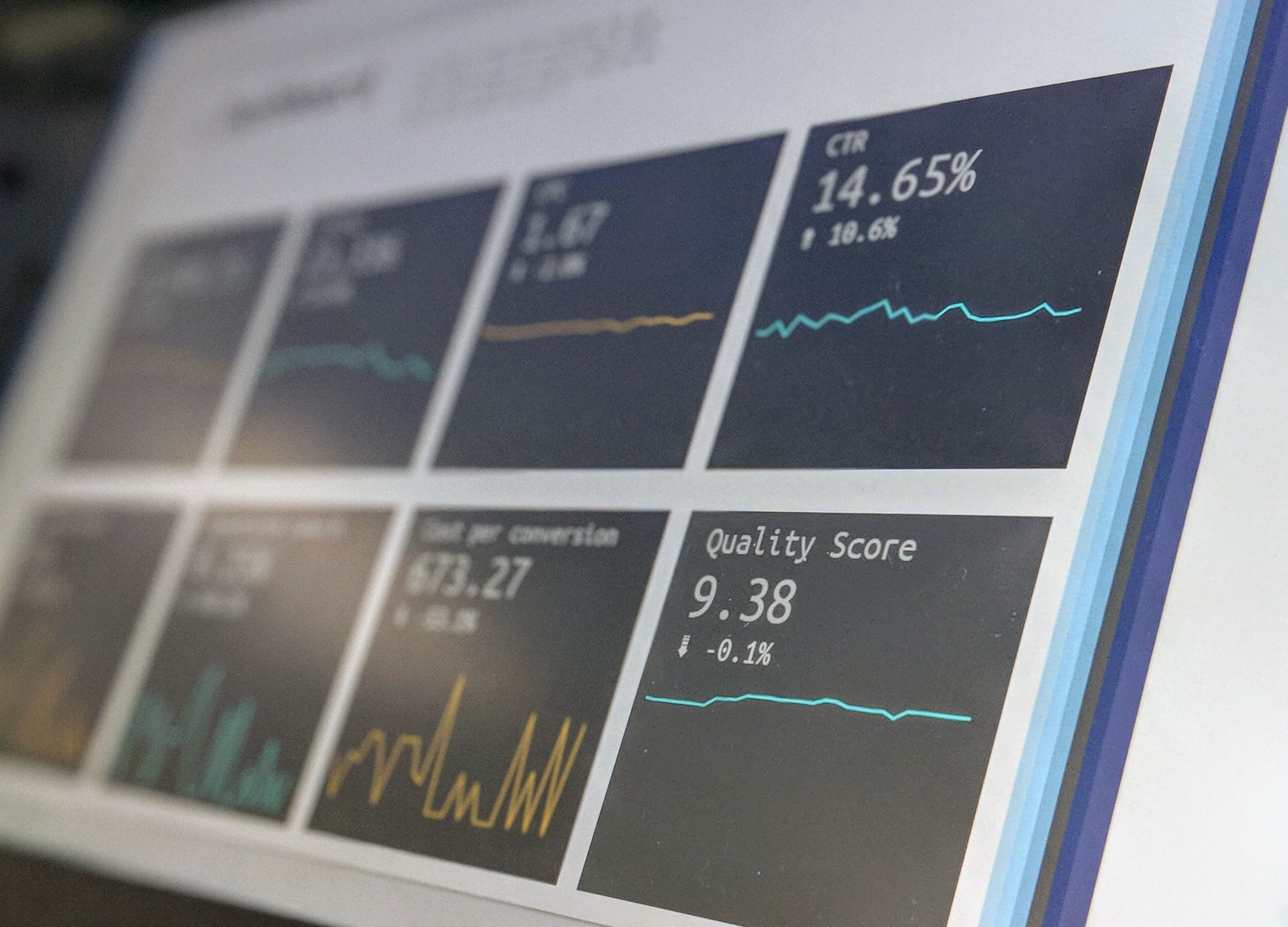
Data Management
The final project for the Data Management course allowed for students to create a marketing infographic that included essential data to positively influence the intended audience. The information provided in the project helped tell a complete story that highlighted key issues and goals of an organization even within a quick five minute glance. Select the “Primary Artifact” button below to view the project for this course. A summary of the course and a reflection on the artifact is below as well.
Author: Lee Brimmage
Date: November 24, 2020
PRT 504 | Fall 2020
NC 4-H Congress | “Feeding Children Everywhere” Service Project
Summary
The Data Management course was one that I was really excited about taking when I first viewed the syllabus. I’ve always been curious on how to make an abundance of data make sense in a very simplistic and understandable manner. I’ve always seen data points from numerous companies and often wondered how they collected and managed to put that data together in a very eye-catching manner for their intended audiences. I was also interested to see what new data programs would surface from my fellow classmates as we discussed our projects. One of the most critical questions I’ve always had when dealing with extreme amounts of data would be answered in this class - How do I utilize all of this data once it is collected? I’ve learned throughout this course that, “all data isn’t good data” because it has to be organized properly and have a true purpose. Some of the concepts introduced in this course were refreshers that I’ve seen before, such as SMART objectives, but some concepts were absolutely new such as how to construct codebooks and conducting T-Test! Sometimes all of the ways to use data could be a little overwhelming, but it was extremely beneficial to know that there were several ways to make data make sense! This course taught me how to be very concise and detailed when it comes to gathering information to form actionable goals and objectives. I believe my favorite thing about this class was that it was quite refreshing and a good switchup from writing papers, posting to discussion boards, and taking quizzes!
Hyde County 4-H | Search and Rescue Program (Drones)
Reflection
My current position with the 4-H Youth Development program in Hyde County is highly dependent upon having positive relationships with key stakeholders to ensure that our funding efforts will be successful well into the future of our organization. One way that we can guarantee this is by compiling data that accurately depicts the impact that we are having in our community with youth and adults. Many times we have tons of data that illustrates the amount of funds we have secured through grants and sponsorships and contact data for participation numbers, but it’s often tough to tell a simple, yet compelling story to an audience using this abundance of data. We receive National 4-H Annual Reports for programming efforts and outcomes, which is awesome, but sometimes it is difficult to find ways to properly use the information. During this course, it has taught me how to effectively “tell a story” using data and display it in various forms including graphs, tables, percentages, and other methods. I also learned a lot about how to comprehend and use pivot tables! I have always shied away from using pivot tables out of fear of the unknown, and now it has became a great resource that has been added to my toolbox of skills! Creating the final infographic in this course of my current organization has been very effective and I have used the data in numerous presentations and reports to secure additional funding which has increased from the previous fiscal year. Thanks to this course, data is now fun because I know how to make it work in my favor!


